Spatly Marks
The first-party visual kit: UI icons, map markers, ornaments, chart marks and live affordances, and how to use it in Studio, on the map, and in your own apps via the export package.
What it is
Spatly Marks is an original SVG kit, not a Lucide clone: 128 UI icons on a 24 px grid with a 1.5 px stroke and a recurring diagonal survey tick, 22 map markers on a 32 px grid that load into MapLibre as SDF images, atlas ornaments (north arrow, scale bar, neatline, corner ticks, graticule, legend frame, title block), chart marks that match the map language, and animated live affordances (pulse, scan, flow, stale, offline). The Spatly logo is part of the set: a rounded ink square holding a tile grid whose upper-right triangle steps from half to full accent along the diagonal while the lower-left tiles fuse into a white staircase.
Marks follow your theme tokens: stroke colour is currentColor, highlights and the logo tiles use --sp-color-accent, and the night and ops variants change nothing but the tokens.
The gallery
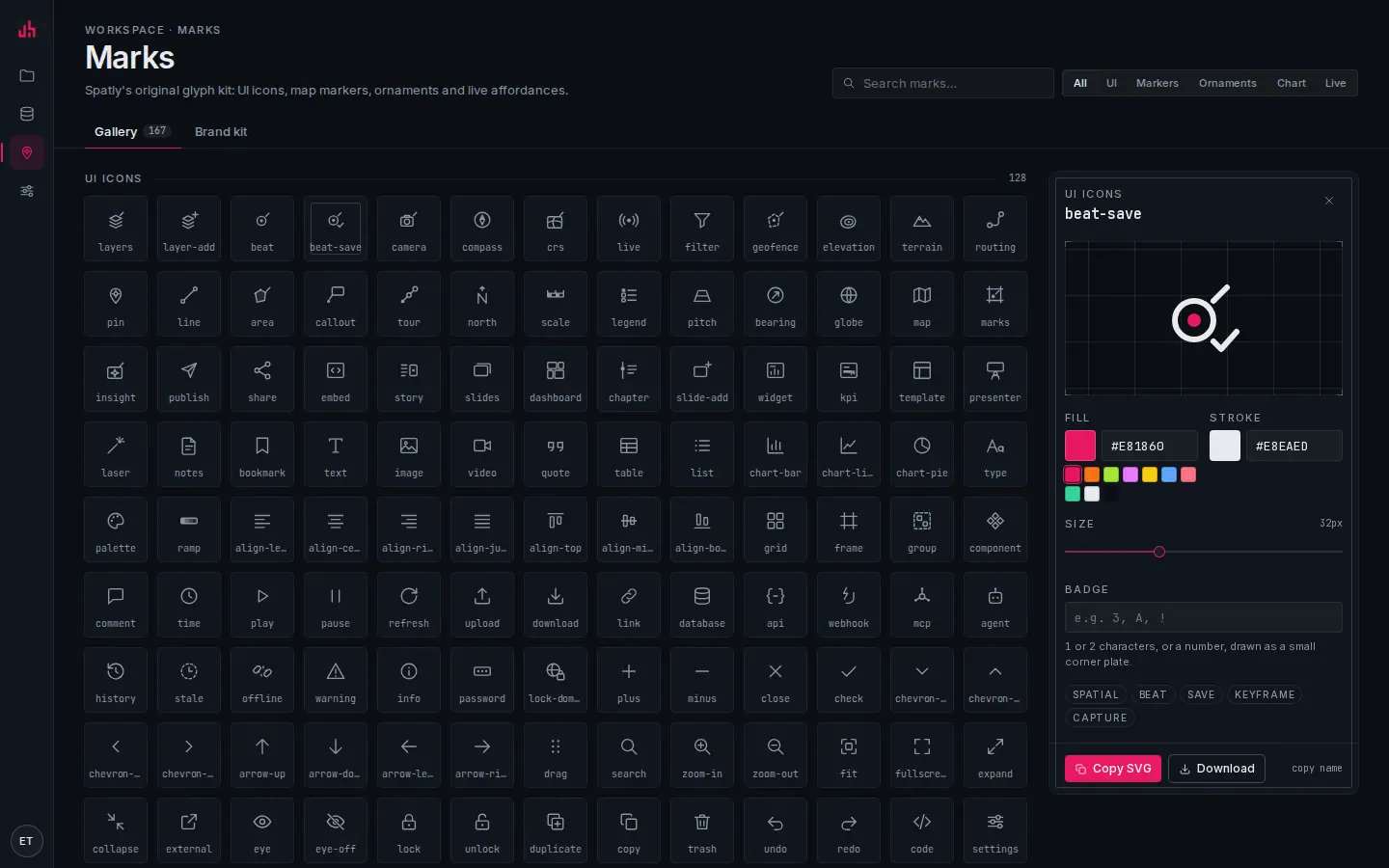
- Search: by name or tag (incident, facility, chevron, cluster…).
- Categories: All · UI · Markers · Ornaments · Chart · Live.
- Grid: 167 marks in this workspace's set, named.
- Fill and stroke: recolour the selected mark from the workspace palette or a hex value.
- Badge: one or two characters drawn as a small corner plate: a number for a tour stop, a letter for a site.
- Copy SVG · Download: the edited mark, ready to paste or drop into a repository.
- Brand kit: the workspace logo, accent, watermark and fonts.
In Studio
- Every rail, panel and map control uses Marks.
- Layer symbols, annotation pins, tour stops and chart marks are picked from the same catalog in the style editor (search by name or tag: incident, facility, chevron, cluster …).
- The Mark editor (the right-hand panel of the gallery) recolours a mark, adds a one- or two-character badge, resizes it, and hands it back as SVG: Copy SVG to the clipboard, or Download as a file.
Names
UI icons (excerpt): layers layer-add beat beat-save camera compass crs live filter geofence elevation terrain routing pin line area callout tour north scale legend pitch bearing globe map marks insight publish share embed story slides dashboard chapter widget kpi template presenter laser notes bookmark time play pause refresh upload download link database api webhook mcp agent history stale offline warning info password lock-domain search zoom-in zoom-out fit fullscreen expand collapse external code settings spark magic user workspace mobile tablet desktop wall sun moon ops.
Map markers (22): pin pin-solid pin-numbered pin-lettered cluster chevron dot dot-ring facility incident chapter tour-stop camera station vehicle warning home flag cross square triangle diamond.
The full list with tags lives in MARK_CATALOG and in the gallery at /app/marks.
The package
npm i @spatly/marks
import { Mark, SpatlyLogo, ORNAMENTS, LiveAffordance, markSvg, loadMarkImages } from "@spatly/marks";

<Mark name="beat" size={16} />                       // inline SVG, currentColor
<Mark name="marker:pin-numbered" label={3} size={32} />
<SpatlyLogo size={22} wordmark accent="var(--sp-color-accent)" />
<LiveAffordance kind="pulse" size={16} />
<ORNAMENTS.NorthArrow size={48} bearing={-18} />
<ORNAMENTS.ScaleBar metersPerPixel={38} maxWidth={160} />
markSvg("marker:incident", { size: 32, fill: "#b91c1c" });          // full <svg> string
markDataUrl("kpi");                                                  // data: URI for CSS
await loadMarkImages(map);                                           // registers "mark:<name>" images (SDF)
map.addLayer({ type: "symbol", layout: { "icon-image": "mark:pin-solid" }, paint: { "icon-color": "#0891b2" } });
| Export | What |
|---|---|
Mark, MarkSprite, MarkUse | React components; <MarkSprite> once at the root, <MarkUse> references it |
UI_ICONS, MAP_MARKERS, CHART_MARKS | raw inner markup keyed by name |
ORNAMENTS | NorthArrow ScaleBar Neatline CornerTicks Graticule LegendFrame TitleBlock |
LiveAffordance, LIVE_CSS | animated states; honours prefers-reduced-motion |
SpatlyLogo, spatlyLogoSvg, faviconSvg | the mark, with or without wordmark |
markSvg, markDataUrl, buildSprite, loadMarkImages, exportPackage | runtime helpers |
MARK_CATALOG, searchCatalog | names, categories and tags for pickers |
Export for your own app
Marks → Export in the app (or exportPackage() in code) produces a zip with:
sprite.svg: one<symbol>per mark,<use href="sprite.svg#icon-beat">marks.tsx: typed React components, no runtime dependencymaplibre-images.json: name → SDF PNG data formap.addImagetokens.css: the colour tokens the marks reference
Marks exported from your workspace may be used in your own products, including commercial ones; the kit itself may not be resold as a standalone icon set. See Terms.
Design rules, if you extend the set
- 24 grid, 1.5 stroke, round caps and joins, square-ish geometry, one diagonal tick where the concept allows.
- Markers: 32 grid, a single filled path where possible so the SDF stays crisp at any colour; anchor at the tip for pins, centre for dots.
- Ornaments use hairlines (
--sp-color-line,--sp-color-lineStrong), never drop shadows. - Live affordances animate transform and opacity only; nothing moves under
prefers-reduced-motion.
Verified on 2026-09-02 against the local development build (gallery, search, category filter, recolour, badge and Copy SVG on /app/marks).
Something wrong or missing? Write to hello@spatly.io.