Theming
The four variants, design tokens, per-surface overrides, basemaps, the brand kit, and how what you design becomes what gets published.
Variants
Every surface carries a variant in settings.variant:
| Variant | Looks like | For |
|---|---|---|
light | warm paper, #f4f2ec ground, #fbfaf6 surfaces, ink #101418 | print-like stories, embeds on light sites |
dark | noir, #0b0f14 ground, #11161d surfaces, ink #e8eaed | the default for new surfaces; most dashboards |
night | dark with reduced glare | presenting in a dim room |
ops | pure black, high contrast, 17 px base, tighter radii | a wall display read from across the room |
The variant switch in the top bar is not a preview toggle. It writes settings.variant on the surface, and that value is what the canvas, Preview and the published page all render. Design in dark and the published page is dark.
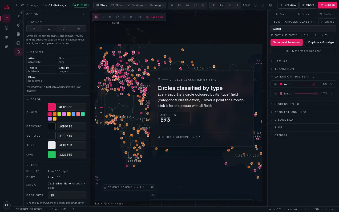
- Variant: sun, moon, night, ops. Saved on the surface.
- Basemap: the project default: Atlas (paper), Noir (ink), Terrain (hillshade), Satellite (imagery) or Blank. A beat can override it.
- Accent: the one colour that carries meaning across chrome, marks and charts.
- Background · Surface · Text · Live: the four ground tones.
- Type: Inter for everything, JetBrains Mono for coordinates and code. Fixed by design, shown here so you know what is being used.
- Base size: 12 to 20 px; every other size is derived from it.
The three places a variant can be set, in order of precedence:
?variant=on an embed URL, which changes the chrome only, and only for that view.settings.varianton the surface, which is what Studio's switch writes and what publishing uses.- A fallback derived from the basemap (a noir basemap implies dark).
note?variant= changes the chrome, not the map. The map palette is baked into the published snapshot, so an embed in night keeps the map colours the author approved.
Tokens
Tokens are CSS custom properties generated from one source (@spatly/tokens) into CSS variables, MapLibre style snippets and SVG parameters, so chrome, map and marks cannot drift apart.
--sp-color-accent   --sp-color-bg        --sp-color-surface     --sp-color-text
--sp-color-line     --sp-color-lineStrong --sp-color-live       --sp-color-warning
--sp-radius-sm|md|lg   --sp-type-display|body|mono   --sp-type-baseSize
--sp-shadow-*          --sp-motion-fast|base|slow    --sp-motion-easing
A subtree renders in a variant by carrying data-theme="light|dark|night|ops". That is how the Studio canvas can be dark while the app chrome around it is light, and how an embed can differ from its host page.
Per-surface overrides
The Design panel writes into surface.themeOverride, which is merged on top of the workspace theme for that surface only:
{
  "color":  { "accent": "#0e7490", "bg": "#08131a", "surface": "#0e1c25", "text": "#e6f1f5", "live": "#22c55e" },
  "radius": { "sm": 4, "md": 8, "lg": 14 },
  "type":   { "baseSize": 15 },
  "chrome": { "panelGlass": true, "neatline": true, "watermark": "© Your Org" }
}
Reset in the panel header clears the whole override and returns the surface to the workspace theme.
chrome.panelGlass: glass narrative panels (backdrop-filter: blur(14px)) versus solid.chrome.neatline: the 1 px inset rule on panels, cards and map frames.chrome.watermark: a short line placed in the map's corner stack, next to the attribution.
Type
One family everywhere: Inter for display, headings, body and UI, with JetBrains Mono reserved for coordinates, ids and code. Headings differ from body only by size, weight (600/700) and tighter tracking. This is a product rule, not a default. The panel shows the fonts rather than offering to change them, because a second display face is how a cartographic product starts looking like a template.
The one type control is Base size (12 to 20 px). Everything else scales from it: 11 / 12 / 13 (UI) / 15 (body) / 18 / 24 / 32 / 48 / 64.
Basemaps
| Id | What it is |
|---|---|
atlas | paper light, the default for print-like stories |
noir | ink dark, the default for dashboards and night reading |
terrain | hillshade, for anything about relief |
satellite | imagery |
blank | no basemap; your layers on the ground colour alone |
The project sets a default; any beat can override it, so a chapter can move from paper to imagery as part of the flight.
Brand kit
Workspace-wide, under settings:
- Logo: used on the workspace profile and available to surfaces.
- Accent colour: the workspace default accent, inherited by every new surface.
- Watermark: a short attribution line for maps.
- Font URLs: up to four self-hosted font files if your brand requires them.
The brand kit becomes the workspace's default theme, so a new project starts on-brand without anyone applying anything.
Marks follow the theme
Spatly Marks take their stroke from currentColor and their accent from --sp-color-accent, so a variant change restyles every icon, map marker and ornament without any per-mark work. The same is true for chart colours, which come from the token ramps.
Reduced motion and contrast
prefers-reduced-motion→ camera flights become jumps, live pulses stop, transitions have zero duration.- Chrome over the map picks its ink from the map's actual tone, not from the page variant: a light story over a noir map still reads, and so does the reverse.
- Coordinates and numerals are tabular so columns of numbers line up.
Checking your work
The Preview width switch (fit · wall · desktop · tablet · phone) renders the real layout at that width, including the phone layout of a story. Combine it with the variant switch: four variants × five widths is twenty checks, and they take about a minute.
Verified on 2026-09-02 against the local development build (four viewers × four variants at 1440 px and 390 px).
Something wrong or missing? Write to hello@spatly.io.